Case study: Helpspace.io

Hi! I'm Cyril Nicodeme I am a French web developer passionate in building services. My favorite stack is Python (Sanic) with VueJS.
I founded Reflectiv with my friend, Antoine Minoux, and we've built various online services. From there, we built, grew and sold VoilaNorbert.com, Transferslot.com and ImprovMX.com.
I'm now focusing my time on PDFShift - an HTML to PDF API conversion and Fernand - a SaaS-focused customer support.
Feel free to contact me to talk about anything! Happy to chat!
Helpspace.io is a customer support product that got my attention on ProductHunt for a few reasons:
The name is easy to remember
The design of the landing page is nice
Customer support is a trending market
All in all, I think the makers behind Helpspace have a chance to do something nice with their tool, and that's why I decided to do a case study about it.
I initially used GrooveHQ for quite some time. It was the best tool and worked nice, but they increased the price twice and ended up in a pricing strategy that wasn't for me ($19 per seat monthly, with a minimum of two seats ... For a sole founder, it doesn't make sense.)
I am currently using Front which provides a complete tool for a good price, but it has its few quirks. For instance, Twitter's integration comes at $20/month. It's too much when you are on the $9/month plan!!
Needless to say that I spent a fair amount of time comparing a lot of competitors, looking at their features, pricing, options, and differences.
So when I saw this newcomer, I was interested to know more about it, and the first impressions are positives.
An earlier version of this post was targetting the makers directly by saying "you", but it gave an arrogant tone to the document, and as such, has been rewritten. It wasn't my intention to give this feeling.
Feedback
There are currently two main ways to offer a landing page:
A short version with links that point to specific pages (features, pricing, etc)
Or a long version that contains everything. Bonus to point to also have a (not duplicated) dedicated page for each point for SEO and advanced explanations.
Helpspace's landing page is nice because the design is lightweight but as a potential user, I think I was expecting more. The main lacking point I found was the absence of the price directly accessible. Let me explain:
I started to scroll, eager to see the features, and they started to convince me (great!), so my next thought was "how much?". But from there, I couldn't find the pricing options: I had to go all up to find it on the menu.
I would recommend either have the pricing options on the landing page directly (where a quick scroll brings it into view) or have a sticky menu to always have access to the pricing page.
Bonus point if you set the pricing page next to the features, as it was my next thought.
Hero
Also called Above the fold. It's the most important element of any website because visitors that are hesitating will leave your website if the hero doesn't convince them.
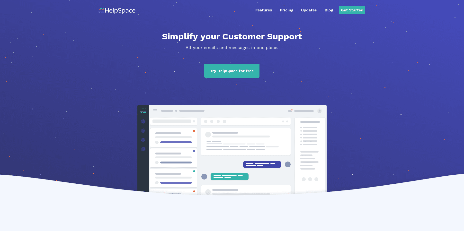
The image is great because it shows the potentially interested visitors what they'll get if they create an account, and it looks like the makers have made an interesting work in analyzing their persona:
The simplification of the image is made in such a way that for someone that knows how customer support works, it's easy to target the messages, the comments, the user's info, etc. Nice job!
One point that bothers me though, is the headline. If you scroll a little bit, you'll get this:
Keep Your Support Under Control
With HelpSpace you will keep your incoming requests and questions in line and won't fail your customers!
This feels like a headline... too. There already is a headline in the hero section so I would recommend choosing between one of them. Both are great and this might depend on everyone, but what I highly recommend is to spend a lot of time working on the phrasing and the words used.
This utterly important because it's the first thing your visitor will read. They need to understand it without reading every word. If you don't catch their attention there, you might lose them even before they start scrolling!
Video explainer
Customer support tools can quickly become feature-rich and having just an image on the landing page might not convey all the great features the service has to offer.
What I would recommend instead, is to keep this image (love it!) but add a "play" icon in the middle that suggests a video. When the visitor will click on it, a modal would open with a 1-1:30 minutes video of what Helpspace has to offer.
More and more visitors now rely on video to have a quick understanding of what a service does, and offering this as the first step for your visitors (remember, it's the first thing they'll see), will play an important role in your conversion rate.
Features
One big issue of Helpspace is the competitive market. And other than fighting on the price, another possibility is to fight on the features, and how they are available. The features section of Helpspace works great because it's light but goes straight to the point.
The fact that it's not screenshots, but real interactive elements instead is a nice touch! But it can be a double-edged sword! Being used to have non-interactive elements, I thought they were animated gif and didn't bother to click on it.
The first feature is great because it shows you how Helpspace solves a frequent problem: How to handle multiple channels. The colored pills? Clever!
The second feature shows how neat the interface is when replying, and how the details (tag, date, etc) are displayed. This gives an insight into what to expect if you create an account.
Unfortunately, the interactive integration leaves me eager: I'd like to know what happens when I click on each item (tag, canned response, users?, three dots?) because clearly, I can (a "hover" effect is applied when you place your mouse over the icons), but when you click on it, nothing happens.
I'm pretty sure putting these elements here instead of the basic screenshot was a lot of work, but what I would recommend instead, is animated images (can be gif, or small videos), showing what can be done. The video format helps the visitors understand they won't be able to interact while showing them what can be done.
Since Helpspace is pretty recent, I'm sure that the dev team is hard in working on the set of features, and I would recommend them to put at least one more feature here once it's ready.
For information, here's what I would expect from a customer support service. Of course, depending on the vision of the founders, not everything will/might be implemented, but it can help :)
Canned responses
Snooze (mark a message to be re-opened later)
Automations rules
Team management (assigning tickets for instance)
Search engine (with filters maybe, like GMail?)
As for animated sequences, here are a few suggestions:
Receiving a new email
(Quickly) replying to an email
Replying using a canned response
Adding a rule to automate the workflow
Assign the ticket to someone on your team
Change the status of an email (to a custom one maybe?)
Search over all your messages
Switch the view from open/archived/deleted
Pricing
As I've mentioned earlier, I would recommend having an "always accessible" way to view the pricing. It could be on a sticky menu that stays at the top or place the pricing directly on the page. The idea is to have visitors do the less work possible up to the account creation (and get that precious email).
By the way, on a side note, I would recommend to also have the pricing plan in the footer. It's not the case on Helpspace's website but it can only help ;)
On the pricing plan per se, here are a few suggestions I would do:
I would offer two email channels instead of one. Why is that? Simply because with only one email channel, what is the difference between my inbox and Helpspace? By providing two, you start to differentiate.
Limiting to 5 emails on the Pro plan at this price is good, but convey the idea that Helpspace is only made for small businesses. If the idea is to attract bigger customers, I recommend offering some kind of "Enterprise plan" with higher limits.
Pricing is hard. I recommend you to try - a lot - and don't hesitate to increase the prices too.
As for the enterprise plan, one possible way to make it work with bigger clients is to set a base price (say, $49 for 20 channels) and then mention a "+$2/m per channels after that".
Don't go in too many directions
Customer support is a wide area and can integrate many many extra features. Helpspace suggests they are working on two future features (at the time of the writing):
Ticket tasks
Knowledge base
These are very interesting features, and clearly, features that might be asked in the long run, but what I would recommend to the Helpspace team instead, is to first focus on the core features of a customer support service.
Things like canned responses, rules, team assignments, tags, are - in my opinion - more important to implement. Then, once each of the core features are implemented and works great, and only then, I would recommend starting to add satellite features.
If you follow the features of your competitor, you will be just like them. If you are just like them, you won't differentiate and you will be lost in the crowd.
Here's what I would do (but again, this is my point of view):
I would focus on the missing features that are essential when handling support (automated responses via rules, canned responses, office hours, etc) and put the ticket tasks and knowledge base items in the pending todo list.
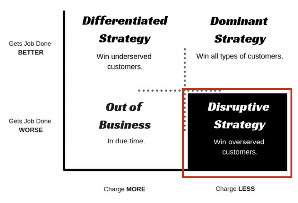
With only the core features, I would be able to lower the price. Yes, this is tricky because everyone says "increase your price", but in Helpspace case, they are in a very competitive market and the price will be a big decision maker since they are new. Take a look at this diagram:

The idea behind this is to get a lot of new customers that are not looking for tons of features (... like knowledge base) but just want a nice interface to manage their support. Helpspace will fit perfectly right in. This will help you grow, get customer feedback, improve the service and add more core features or master the current one.
Once you will have reached a certain amount of customers and have implemented all the core features, you will then be able to work on the extensions, offering tickets, knowledge base and even more, and increase your price from there (or offer these as paid features).
Conclusion
Helpspace looks nice and I think the makers are on the great track of having a really cool SaaS product. I hope my thoughts were helpful and I wish them good luck!

